


When you go grocery shopping, do you want to be greeted by a cast of cartoon characters, a new slogan and a minimalist logo that looks a little like a kid drew it?
Then welcome to Kroger!
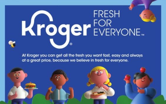
The country’s largest traditional grocery chain is debuting a new look this morning, which it says will showcase its brand as being “optimistic, bright, welcoming and above all, fresh.” It’s doing that with the help of a new logo, a new “Fresh for Everyone” tagline, and a collection of “Kroji” characters that are either lovable, or kind of disturbing, depending on your perspective.
“Kroger’s new brand launch is a unifying framework for our seamless shopping experience that is designed to deepen our connection with customers and associates,” Kroger chief operating officer Mike Donnelly said in a statement.
That’s a lot to put on a brand refresh. But before shoppers see the new look and think – ah, this must signify a unifying framework for Kroger’s seamless shopping experience! – the changes may take a little getting used to.
First, there’s the new logo. Only Kroger itself is affected here, not its various other grocery chains operating under different names. Gone is the oval that outlined the “Kroger.” In its place is just the word “Kroger” in a more straightforward font, stretched and squished a bit more, with more pronounced swoops emanating from the “K” and “G”. “The contemporary evolution of the redesigned Kroger logo reflects the company’s strong, food-rich heritage by retaining the shape and movement of the iconic ‘K’ and ‘G’ loved by generations of Kroger customers,” the company explains. The logo is still the same shade of blue, which “signals Kroger heritage, safety and trust,” while its accompanying “bright and modern” accent color palette is “reflective of the fun and inclusive spirit of the campaign.”
Next, there’s the new slogan. All Kroger-owned chains, with the exception of discounters Food 4 Less, Foods Co, Ruler Foods and the more upmarket Harris Teeter, are now using the tagline “Fresh for Everyone.” This, Kroger says, is “inclusive, clear and memorable and supports our vision of serving America through food inspiration and uplift.”

Finally, there are those creepy/cute cartoon characters, which are already shaping up to be the most polarizing part of this new campaign. Kroger is calling them “Kroji”, as in Kroger + emoji. They are “a lovable cast of characters,” Kroger says, that are meant to “represent Kroger customers, associates and communities in an inclusive, relatable, optimistic and fun way.” Accompanying the new slogan in all of the Kroger-owned stores that are adopting it, the Kroji characters will appear just about everywhere – in stores, on the stores’ websites, in the weekly ads, and in TV commercials and print ads.
And how are customers reacting? Granted, the naysayers are usually quicker to chime in online. But so far, at least, the naysayers appear to be in the majority.
“The characters look like they’re designed by a 4 year old and make me physically ill looking at them,” one Twitter commenter wrote. “These characters do not represent anyone I know,” another commented. “They look like the villains from a Christmas movie you could get on DVD at Kroger,” a third commenter added.
Others are more focused on the logo than the cartoon characters. “Need to find a better graphic designer! This is not a good choice of a font,” one critic opined. “If that becomes your logo I will shop at Meijer,” a particularly offended shopper commented. Another offered this: “’Honey, I decided to switch to Kroger to buy our groceries.’ ‘Why, do they have better prices?’ ‘No, silly. They have a refreshed font!’”
Give it some time, and more positive comments are bound to emerge. And other shoppers simply won’t care, and will wonder why everyone is getting so worked up over a new logo and some cartoon characters. But considering how freaked out everyone got over Kroger’s yellow grocery bags last year, it’s apparent that some don’t take well to what others might consider minor changes.
Minor, maybe, but not cheap. According to Kantar Media, Kroger spent $158 million on advertising last year alone. And the new campaign launching today is the result of a new partnership with Kroger’s first-ever dedicated advertising agency – an expensive proposition. That’s leading some shoppers to grumble that the money spent rebranding, could have been better spent somewhere else. “Spend more money, charge higher prices,” one Twitter commenter complained. “This is a blatant waste of money, the amount spent to roll this out would have been so much better used actually making certain stores better,” another commented.
But Kroger, and its ad agency DDB New York, are standing by the changes. “Advertising in the grocery space was universally a sea of sameness: generic aisles of groceries and close-ups of people cutting carrots,” Lisa Topol, DDB New York’s Co-Chief Creative Officer, said. “Kroger is anything but generic. So we wanted to take their inclusive and uplifting promise to their customers and find an effective and creative way to share it with the world.”
So if you’re a Kroger shopper, better get used to a new logo, a new slogan and new mascots. It may take some time to take it all in – but in the end, it beats looking at people cutting carrots.


I swear Kroger’s new mascots look like extras from the Davey and Goliath cartoons.
Pingback: "The Willoughbys" Is Messy, Madcap Fun | The Spool